When advisors make the move to independence and launch their own firms, they often struggle to select the color, imagery and visual elements. The message is the medium, right? Right. But that message comprises much, much more than words.
Planners spend countless hours laboring over their new name, messaging bullets in their pitch deck and crafting new bios, all while neglecting their visual identity and design — elements that play a critical role in how clients, employees and strategic partners understand a new firm’s brand, key messages and points of differentiation.
Here are the top five areas of design to consider when developing a new brand and core message:
1) Images play the largest part in establishing your brand presence, establishing the overall feeling of your brand and describing what your company stands for or focuses on.
-
-
Tradition, trust and Google all factor into the choice.
February 4 -
Here are 4 steps to take to set yourself — and your firm — apart.
July 1
Some companies prefer to show images of their target audience, better allowing potential clients to visualize themselves engaging with the brand. Others highlight conceptual images, which convey an idea or value. A Dynasty RIA in southern California combined these approaches on its website by highlighting photos and images conveying its core philosophies and the location of the new firm. This created an enhanced visual voice to help viewers understand multiple messaging points in a single experience.
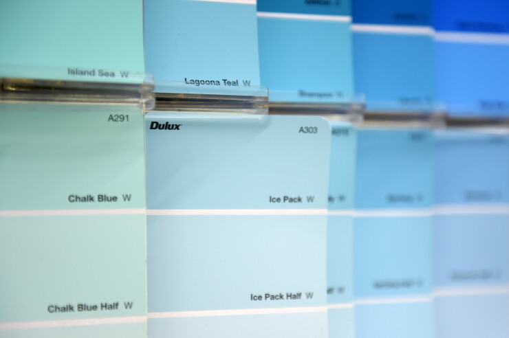
2) Color is a powerful tool to establish a mood or help a viewer to navigate your website. A well-defined palette helps distinguish your firm from its competitors and contributes to the overall brand experience. Color elicits strong emotions and the ones you choose will help engage your desired audience. Color is also a great way to codify services in a brochure or website and can signal which elements on your website are interactive. For example, a large RIA in Chicago carefully selected a primary color in their corporate logo, knowing that they would need to use a complementary set of colors in the key block mark to denote new service lines down the road.

3) Graphic material, including icons, charts, graphs and infographics, provides quick access to information and add personality to printed and digital communications. Icons are particularly effective when a photo is not appropriate or space is limited, and you want to provide a visual cue. A cohesive set of icons can guide a viewer through complex information.
4) Typography — which includes fonts, the weight of the font and the spacing between letters and words is one if the least- appreciated aspects of a brand but crucial when establishing your tone. A typeface can come across as loud or soft-spoken; solemn or lighthearted. It informs your brand voice and how you want your words to be read or spoken. It brings your content to life.
5) The placement of your carefully chosen elements helps your audience navigate information in the order you want them to see it. A rule of thumb for website homepage design, for example, is to configure the information like the letter F. That’s because a viewer’s eye begins at the upper-left corner of a site, reads across your main navigation and then returns to the left, where the second-tier messaging should be placed.
Taken together, these design factors provide the vital emotional connection that will enable clients, employees and strategic partners to align with your new brand. With these foundational elements in place, the visual tone of your brand should work seamlessly with your written and verbal content to celebrate what is unique about your new firm. It will also make it consistently easy to present new content that will strengthen your brand and further engage your audience.


